* 아래의 글은 JavaScript 프롤로그 및 목차를 먼저 읽으신 후 읽으시기를 권장합니다.
* 타입스크립트 기본 문법은 타입스크립트 핸드북 을 통해 학습하시는 것을 추천드립니다.
본 글에서 다룰 내용
- React template을 활용한 타입스크립트 프로젝트 만들기
- 기본 세팅하기
- TodoList 컴포넌트와 디자인 완성하기
본 글에서 사용하는 기술
- TypeScript
- React-Hooks
- Context-API
- SCSS
- Styled-Components
일단 제일 먼저 프로젝트를 생성해야합니다.
타입스크립트 + 리액트 프로젝트를 생성하는 방법은 아주 간단합니다.
yarn add create react-app [project-name] --template typescript
//or
npx create-react-app [project-name] --template typescript
타입스크립트 템플릿만 설정해주면 CRA로 타입스크립트 설정이 되어있는 리액트 프로젝트를 만들 수 있습니다.
이렇게 하면 CRA로 타입스크립트 템플릿을 적용한 프로젝트를 생성할 수 있습니다.
기본 세팅하기
저는 Styled-Components의 styled와 createGlobalStyle을 사용하여 기본 세팅을 했습니다.
App.tsx
import React from 'react';
import styled, { createGlobalStyle } from 'styled-components';

const Rootdiv = styled.div`
  display : flex;
  height : 100vh;
  width : 100%;
  justify-content : center;
  align-items : center;
  flex-direction : column;
`;

const GlobalStyle = createGlobalStyle`
  body{
    padding : 0;
    margin : 0;
  }
`;

const App = () => {
  return(
    <>
      <GlobalStyle />
        <Rootdiv>
        </Rootdiv>
    </>
  )
}

export default App;
GlobalStyle을 사용해 모든 페이지 body의 마진과 패딩을 없애고 시작합니다.
ToDoList에서는 App.tsx에서 모든 컴포넌트를 불러오기 때문에 RootDiv를 사용하여 Div의 크기와 디자인을 설정해주었습니다.
ToDoList를 제작하면서 세 가지 컴포넌트를 제작해야합니다.
- TodoForm.tsx: 새 할 일을 등록할 때 사용하는 컴포넌트
- TodoItem.tsx: 할 일에 대한 정보를 보여주는 컴포넌트
- TodoList.tsx: 여러 TodoItem을 렌더링해주는 컴포넌트
src 디렉토리에 component 디렉토리를 만들고, 그 안에 위 세 개의 컴포넌트를 제작하시면 됩니다.
제일 먼저 TodoForm 먼저 코드를 작성해 보겠습니다.
TodoForm 컴포넌트는 이런 역할을 합니다.
- ToDoList에 등록할 내용 작성을 위한 인풋
- ToDoList에 등록하기 위한 버튼
input의 value값은 useState를 통해서 관리하도록 하겠습니다. submit 이벤트를 통해 새 항목을 생성하는 부분은 #2에서 구현하겠습니다.
src/components/TodoForm.tsx
import React, { useState } from 'react';

function TodoForm() {
  const [value, setValue] = useState('');

  const onSubmit = (e: React.FormEvent) => {
    e.preventDefault();
    // TODO: 새 항목 생성하기
    setValue('');
  };

  return (
    <form onSubmit={onSubmit} className = "todoForm">
      <input
        value={value}
        placeholder="무엇을 하실 건가요?"
        onChange={e => setValue(e.target.value)}
      />
      <button>등록</button>
    </form>
  );
}

export default TodoForm;
저는 SCSS를 사용하여 반응형 웹 디자인을 했습니다.
src/styles/TodoForm.scss
@import './mixin';

@include mobile{
    .todoForm{
        display: flex;
        width: 100%;
        height: 10%;
        align-items: center;
        justify-content: center;
        input{
            display: flex;
            width: 70%;
            height: 34px;
            outline: none;
            padding-left: 10px;
            font-family: 'Noto Sans KR', sans-serif;
            font-weight: bold;
        };

        button{
            display: flex;
            width: 60px;
            height: 40px;
            outline: none;
            cursor: pointer;
            align-items: center;
            justify-content: center;
            font-family: 'Noto Sans KR', sans-serif;
            font-weight: bold;
        }
    }
}

@include tablet{
    .todoForm{
        display: flex;
        width: 100%;
        height: 10%;
        align-items: center;
        justify-content: center;
        input{
            display: flex;
            width: 50%;
            height: 34px;
            outline: none;
            padding-left: 10px;
            font-family: 'Noto Sans KR', sans-serif;
            font-weight: bold;
        };

        button{
            display: flex;
            width: 5%;
            height: 40px;
            outline: none;
            cursor: pointer;
            align-items: center;
            justify-content: center;
            font-family: 'Noto Sans KR', sans-serif;
            font-weight: bold;
        }
    }
}

@include desktop{
    .todoForm{
        display: flex;
        width: 100%;
        height: 10%;
        align-items: center;
        justify-content: center;
        input{
            display: flex;
            width: 30%;
            height: 34px;
            outline: none;
            padding-left: 10px;
            font-family: 'Noto Sans KR', sans-serif;
            font-weight: bold;
        };

        button{
            display: flex;
            width: 5%;
            height: 40px;
            outline: none;
            cursor: pointer;
            align-items: center;
            justify-content: center;
            font-family: 'Noto Sans KR', sans-serif;
            font-weight: bold;
        }
    }
}
모바일, 태블릿, 데스크톱 크기 별로 반응형 디자인을 했습니다.
TodoItem 코드를 작성해보겠습니다.
TodoItem은 이런 역할을 합니다.
- ToDoList에 저장되어있는 내역을 보여줌(id, content)
- ToDoItem을 삭제할 수 있는 버튼
src/components/TodoItem.tsx
import React from 'react';
import './TodoItem.css';

export type TodoItemProps = {
  todo: {
    id: number;
    text: string;
    done: boolean;
  };
}

function TodoItem({ todo } : TodoItemProps){
    return(
        <div className = "todoItem">
            <div className = "ItemIndex">
                <span>{todo.id}</span>
            </div>
            <div className = {`ItemContent ${todo.done ? 'done' : ''}`}>
                <span>{todo.text}</span>
            </div>
            <div className = "ItemBtn">
                <span>삭제</span>
            </div>
        </div>
    );
}

export default TodoItem;
props로는 todo 객체를 받아옵니다.
만약 todo.done 값이 참이라면 done SCSS 클래스를 적용합니다.
src/styles/TodoItem.scss
@import './mixin';

@include mobile{
  .todoItem{
    display: flex;
    flex-direction: row;
    align-items: center;
    justify-content: center;
    width: 90%;
    height : 45px;
    font-family: 'Noto Sans KR', sans-serif;
    border-bottom-style: solid;
    border-bottom-width: 1px;
    margin-bottom: 5px;
  }.done{
    color: #999999;
    text-decoration: line-through;
  };
}

@include tablet{
  .todoItem{
    display: flex;
    flex-direction: row;
    align-items: center;
    justify-content: center;
    width: 50%;
    height : 45px;
    font-family: 'Noto Sans KR', sans-serif;
    border-bottom-style: solid;
    border-bottom-width: 1px;
    margin-bottom: 5px;
  }.done{
    color: #999999;
    text-decoration: line-through;
  };
}

@include desktop{
  .todoItem{
    display: flex;
    flex-direction: row;
    align-items: center;
    justify-content: center;
    width: 35%;
    height : 45px;
    font-family: 'Noto Sans KR', sans-serif;
    border-bottom-style: solid;
    border-bottom-width: 1px;
    margin-bottom: 5px;
  }.done{
    color: #999999;
    text-decoration: line-through;
  };
}

.ItemIndex{
  display: flex;
  width: 5%;
  height: 100%;
  align-items: center;
};

.ItemContent{
  display: flex;
  width: 85%;
  height: 100%;
  align-items: center;
  span{
    cursor: pointer;
  };
}

.ItemBtn{
  display: flex;
  width: 10%;
  height: 100%;
  align-items: center;
  justify-content: center;
  color : red;
  cursor : pointer;
}
TodoList 코드를 작성해보겠습니다.
TodoList는 이런 역할을 합니다.
- TodoItems 컴포넌트를 렌더링 해주는 역할
TodoList에서는 todos라는 배열을 사용하여 여러개의 TodoItems 컴포넌트를 렌더링합니다.
아직은 이 배열에 대한 상태가 존재하지 않으므로 이 배열을 임시적으로 TodoList 컴포넌트 내부에서 선언하겠습니다.
src/components/TodoList.tsx
import React from 'react';
import TodoItem from './TodoItem';
import '../styles/TodoList.scss';
function TodoList(){
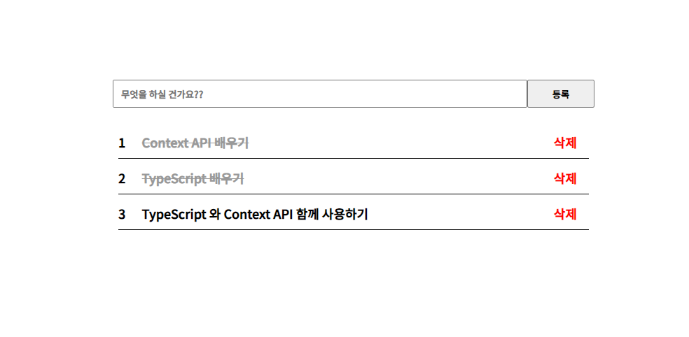
const todos = [
{
id: 1,
text: 'Context API 배우기',
done: true
},
{
id: 2,
text: 'TypeScript 배우기',
done: true
},
{
id: 3,
text: 'TypeScript 와 Context API 함께 사용하기',
done: false
}
];
return(
<div className = "todoList">
{
todos.length === 0 ? <span>오늘 할 일을 등록하세요!</span>
: todos.map(todo => (
<TodoItem todo = {todo} key = {todo.id} />
))
}
</div>
)
}
export default TodoList;저는 todoList div 내에서 삼항 연산자를 사용해 todos배열의 길이에 따라 다른 모습을 보여주도록 했습니다.
src/styles/TodoList.scss
.todoList{
    display: flex;
    width: 100%;
    flex-direction: column;
    align-items: center;
    span{
        font-family: 'Noto Sans KR', sans-serif;
        font-size: large;
        font-weight: bold;
    }
}
마지막으로 앞에서 코딩한 컴포넌트를 App에서 렌더링 해봅시다.
src/App.tsx
import React from 'react';
import styled, { createGlobalStyle } from 'styled-components';

const Rootdiv = styled.div`
  display : flex;
  height : 100vh;
  width : 100%;
  justify-content : center;
  align-items : center;
  flex-direction : column;
`;

const GlobalStyle = createGlobalStyle`
  body{
    padding : 0;
    margin : 0;
  }
`;

const App = () => {
  return(
    <>
      <GlobalStyle />
        <Rootdiv>
          <TodoForm />
          <TodoList />
        </Rootdiv>
    </>
  )
}

export default App;
위의 코드를 따라 하시면 예쁜 ToDoList가 나올 것 입니다.
다음 #2 글에서는 ContextApi를 사용하여 실제로 작동하는 ToDoList를 구현해보겠습니다.
혹시나 오류가 나거나, 조금 더 효율적인 코드가 있다면 댓글 남겨주세요!🥰
긴 글 읽어주셔서 감사합니다😁
참고 문헌 및 사이트
- Velopert TypeScript 환경에서 리액트 Context API 제대로 활용하기
- React Context 공식문서
- [React에서 TypeScript 사용하기] #4 Context API
전체 코드는 제 깃헙 링크에서 확인하실 수 있습니다.
TS-ToDoList - https://github.com/Bigstar1108/TS-ToDoList
긴 글 읽어주셔서 감사합니다😀
'TypeScript' 카테고리의 다른 글
| TypeScript 타입스크립트 + 리액트를 활용해 TodoList 만들기 #2 (0) | 2020.07.22 |
|---|---|
| TypeScript 타입스크립트를 사용해 블록체인 개발하기 #2 (0) | 2020.07.20 |
| TypeScript 타입스크립트를 사용해 블록체인 개발하기 #1 (0) | 2020.07.20 |
| TypeScript tsc-watch 사용하기 (2) | 2020.07.16 |
| TypeScript 타입스크립트 세팅 방법 (0) | 2020.07.16 |


